 [Another solo post by Kym]
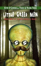
We recently attended a community-wide signing, where a number of authors displayed their books along a row of tables. Writers, of course, sat behind the tables, waiting for potential buyers to approach and pull out their wallets. Since Mark and I write as a team, I left the entrepreneurial details to him and wandered around browsing the merchandise. Didn’t take me long to realize whose covers were successful by the reaction of the customers. Finally, I sauntered over to our corner of the building just in time to observe a young father reaching for one of our books, Little Greed Men. He studied the intrusive and slightly caustic alien face monopolizing the cover. Then he turned it over and read the reviews.
“I like this. It’s funny.”
Success! Our potential buyer had grasped the meaning
immediately – that our novel consisted of an irreverent comedy. He looked at the cover, walked away and, as we were getting up to leave, he returned
to pick it up and read the back cover more closely. With two toddlers in tow, he told me he was going to go get
his wife's wallet and come back to buy it – hopefully he did after we left, but who
knows?
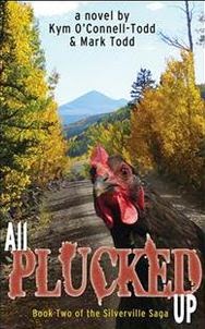 At another signing/reading, a woman purchased the second
book of our series, one graced with an “in your face” chicken against a lovely
mountain backdrop. I asked why she chose book two instead of book one. Her
answer: “I don’t know. The cover just grabbed me.”
At another signing/reading, a woman purchased the second
book of our series, one graced with an “in your face” chicken against a lovely
mountain backdrop. I asked why she chose book two instead of book one. Her
answer: “I don’t know. The cover just grabbed me.”
What pleased me about these two recent incidents was the
attention the covers garnered. Each caught the eye, and both left no mistake
about the contents of the pages. It’s what I strived to do when I created them
– hinting at the essence without trying to tell too much of the story in
images.
This becomes particularly vital if you intend to market your
book to e-readers. Keep in mind, what might look good on a full-size paperback
could be completely lost on the tiny thumbnails posted on Amazon or Barnes
& Noble. Simple and strong images offer insight and texture to the story
and will help readers recognize the genre they are about to buy.
 Not long ago, I created a cover for a historical biography.
With the topic already familiar, my gut instinctgravitated toward sepia colors
and torn wallpaper, but the publisher envisioned different elements. His idea
turned out lovely, but to me, the cover just didn’t represent the contents. I
sent him a second option – sepia colors and torn wallpaper. In the end, we
compromised on our two ideas until we were both happy with the results.
Not long ago, I created a cover for a historical biography.
With the topic already familiar, my gut instinctgravitated toward sepia colors
and torn wallpaper, but the publisher envisioned different elements. His idea
turned out lovely, but to me, the cover just didn’t represent the contents. I
sent him a second option – sepia colors and torn wallpaper. In the end, we
compromised on our two ideas until we were both happy with the results.
Choosing a design for your book jacket may not be an option
if you’ve sold your work to a publishing house, although some may be open to
your ideas. For those who choose to self-publish, shop around for a designer
who not only has experience in the field, but also someone you can work with
comfortably when making revisions. For me, reading a synopsis helps me to “feel”
the heart of the story, which in turn, translates into a narrative image.
For you, ending up with a great cover design translates into
sales. Forget that your grandma told you not to judge a book by its cover. She
was wrong when it comes to the literary world.
Feel free to stop by our website, writeinthethick.com, to see a few sample
covers.
No comments:
Post a Comment